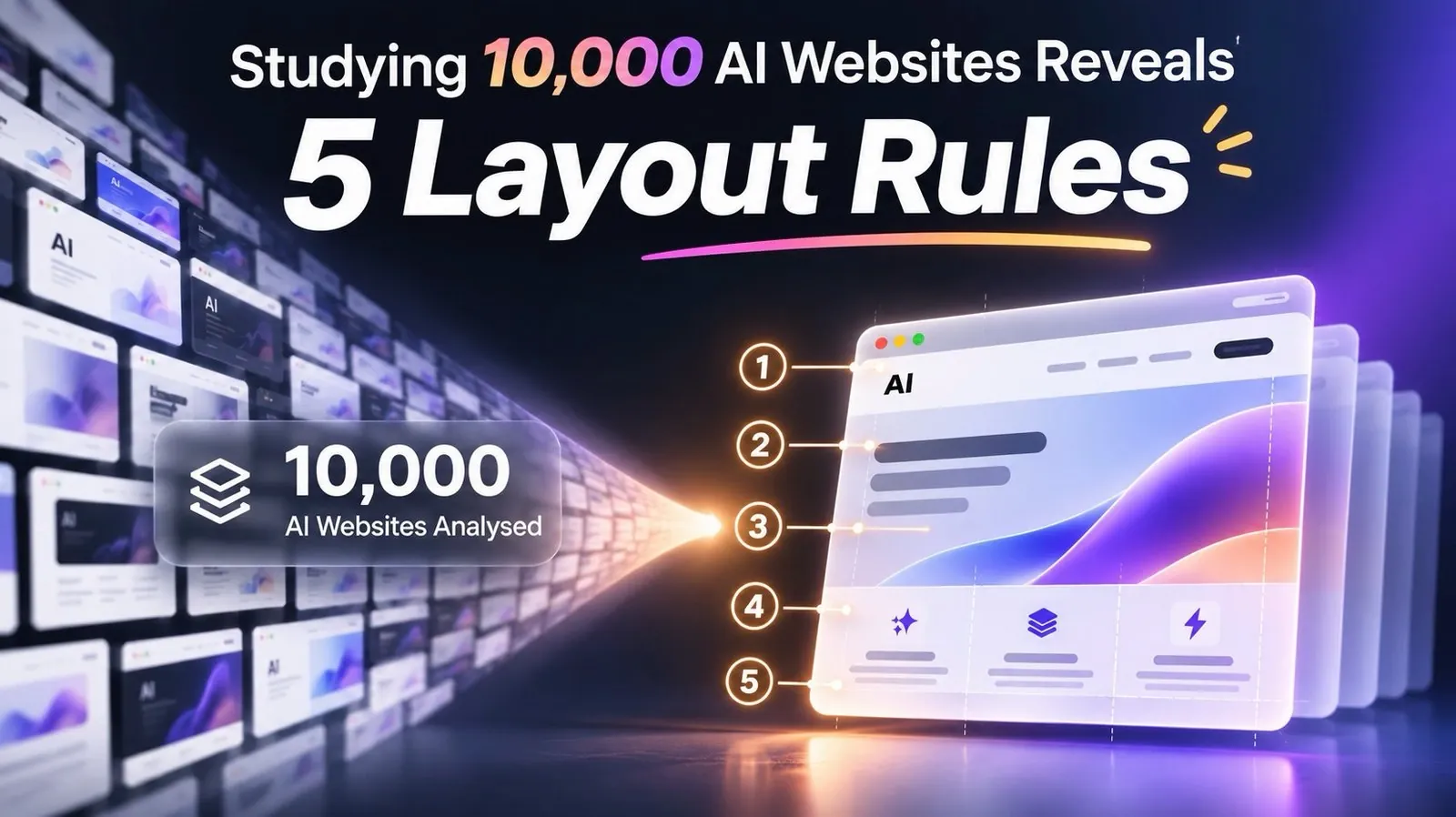
Over 10,000 AI websites were examined by Nate Herk to identify what separates high-performing designs from those that fail to engage users. One standout finding is the importance of tailored messaging, which ensures that a website’s content directly addresses its audience’s needs. For example, Truckers Report, a job site for truck drivers, saw a significant 79.3% improvement in conversions after redesigning its homepage to focus on drivers’ specific concerns, such as mobile usability and clear calls to action. This kind of targeted approach can elevate a website’s effectiveness.
Explore how strategies like the “mirror test” for messaging, the 60-30-10 color principle, and purposeful motion can enhance user engagement. You’ll also gain insight into how layering design elements creates visual depth and how interactive features, such as cost calculators or product visualizers, can make websites more engaging. These takeaways provide actionable steps to refine AI-generated websites and ensure they resonate with users.
5 Key AI Website Strategies
TL;DR Key Takeaways :
- Tailored messaging is crucial for AI-generated websites to connect with specific audiences. Examples include Truckers Report improving conversions by 79.3% and City Click increasing click-throughs by 90% through targeted headlines.
- The “Highlighter Rule” and “60-30-10 Color Principle” help guide user attention and improve design clarity. Overusing accent colors can make websites appear cluttered, as seen with the AI Automation Society’s redesign.
- Adding depth through a “front, middle, back” structure enhances visual appeal and creates a premium feel. This technique, demonstrated by the AI Automation Society homepage, involves layering backgrounds, content, and call-to-actions.
- Purposeful motion, such as scroll animations, can enhance user experience when used sparingly and intentionally. Overuse or unfocused animations may distract users and reduce usability.
- Interactive tools, like cost calculators or visualizers, significantly boost engagement and conversions by offering users a “free sample” of value. Examples include Doc Braces achieving a 45% conversion rate with a braces cost calculator.
1. Tailored Messaging: The Mirror Test
AI-generated copy often struggles to connect with specific audiences due to its lack of precision. Websites that fail to address user needs directly risk losing potential customers. For example, Truckers Report, a job site for truck drivers, initially had a conversion rate of 12.1%. Its original design featured a generic headline and a stock handshake photo, which failed to engage its audience. With half its traffic coming from mobile devices, optimizing for mobile users was critical. A redesign focused on drivers’ needs led to a 79.3% improvement in conversions.
The “mirror test” ensures the first screen of a website answers three critical questions:
1. Who is this for?
2. What do I get?
3. What do I do next?
For instance, City Click increased click-throughs to its pricing page by 90% by changing its headline from “businesses grow faster online” to “create a web page for your business.” Similarly, Campaign Monitor boosted signups by 31.4% by aligning its headline with users’ search terms, such as “design,” “create,” or “build.”
Websites applying these tailored messaging principles can often be sold to businesses for $1,000, highlighting the value of addressing user needs effectively.
2. The Highlighter Rule and 60-30-10 Color Principle
Color is a powerful tool for guiding user attention. The highlighter rule suggests using one standout color exclusively for key actions, such as buttons or booking links. Overusing accent colors can dilute their impact, making the site appear cluttered and less professional.
The 60-30-10 rule refines color usage by allocating:
– 60% to a main color (e.g., background),
– 30% to a secondary color (e.g., text or menu),
– 10% to an accent color (e.g., buttons or links).
For example, the AI Automation Society website initially overused blue, giving it a cheap appearance. Switching to a predominantly black-and-white palette with blue accents improved its clarity and premium feel. Tools like Coolors can help generate balanced color palettes, which can then be implemented using AI tools such as Claude.

Expand your understanding of AI design with additional resources from our extensive library of articles.
- Google Stitch vs Figma : Will AI Design Replace Your UI Team?
- Google Stitch Guide : No-Code to Working App in Minutes With Gemini 3
- How AI is transforming 3D product design
- Stable 3D AI creates 3D models from text prompts in minutes
- Create Stunning Presentations Effortlessly with Genspark AI Slides
- The Fastest Way to Start Coding with AI Tools (No Code) Beginners Guide
- 7 AI tools to design websites from wireframe to final landing page
- 5 Cutting-Edge AI Tools Every Designer Needs to Unlock Creativity, Colors and More
- How to create amazing vector images using AI and Adobe Illustrator
- Google Stitch : The Figma Killer Transforming UI Design in 2025
3. Depth and Layering: Front, Middle, Back
Flat, one-dimensional designs often make AI-generated websites feel low-quality. Adding depth through a “front, middle, back” structure creates a more polished and premium look. This approach mimics a stage setup:
– The back layer sets the scene (e.g., a photo or soft shape).
– The middle layer contains the main content (e.g., text or cards).
– The front layer highlights the call-to-action (e.g., a button).
The AI Automation Society homepage demonstrates this technique effectively. Its design includes mountains in the background, a timeline and laptop in the middle, and a prominently placed button in the foreground. Adjustments, such as cutting a V into the tree line, ensured the button remained the focal point.
To implement this pattern:
- Add a real background (e.g., a product photo or soft shape).
- Let one element break the edge to avoid a boxy look.
- Use shadows to lift key elements, like buttons, to the forefront.
This “front, middle, back” pattern enhances visual appeal and creates a more engaging user experience.
4. Purposeful Motion
Scroll animations can add a premium feel to a website but must be used with clear intent. When overused or unfocused, animations can distract users and make a site feel overproduced. Research supports this: a Purdue study found that while parallax scrolling made a site feel more fun, it did not improve usability or aesthetics.
Effective motion design is exemplified by the Apple AirPods Pro page, where scrolling reveals the product from different angles, simulating the experience of holding it. Similarly, Scrollcraft is a free website design skill that incorporates scroll-driven animations, layering, typography, spacing, and depth. Scroll animations should serve a specific purpose, such as showcasing a product, pointing to the next step, or highlighting a recent action.
To use motion effectively:
- Limit movement to one element per screen.
- Ensure text and buttons are immediately readable.
- Provide an option to disable motion, as about a third of adults over 40 experience motion sensitivity.
5. Interactive Tools: The Free Sample
Interactive tools that provide users with a “free sample” of the website’s value can significantly enhance engagement and conversions. This approach draws on the IKEA effect, where users value results they help create. Research also shows that touching a product increases its perceived value, making users feel as though it is already theirs.
For example, Doc Braces, a Canadian orthodontist, added a braces cost calculator to its site, achieving a conversion rate of 45%. Other effective interactive tools include:
- Wise’s currency converter.
- Zillow’s home value estimator, which allows users to type in their address to see an estimate of their home’s worth.
- Sherwin-Williams’ paint visualizer, which lets users upload a photo of their room to test paint colors.
- Amazon’s augmented reality feature, which allows users to visualize furniture or other items in their room before purchasing.
These tools address common customer questions and make the results feel personalized. To succeed, they must be simple and quick to use, encouraging users to complete the interaction.
What These Patterns Mean
Based on this analysis, AI websites can achieve strong results when they are tailored to user needs and designed with purpose. Generic AI-generated designs and copy often fall short, but applying these five patterns, tailored messaging, strategic color use, depth through layering, purposeful motion, and interactive tools, can transform them into high-performing platforms. However, success depends on thoughtful implementation, as excessive motion or poorly designed tools can undermine the user experience. For businesses seeking to create or improve AI websites, these strategies provide a clear roadmap to better engagement and conversions.
Media Credit: Nate Herk | AI Automation
Disclosure: Some of our articles include affiliate links. If you buy something through one of these links, Geeky Gadgets may earn an affiliate commission. Learn about our Disclosure Policy.
