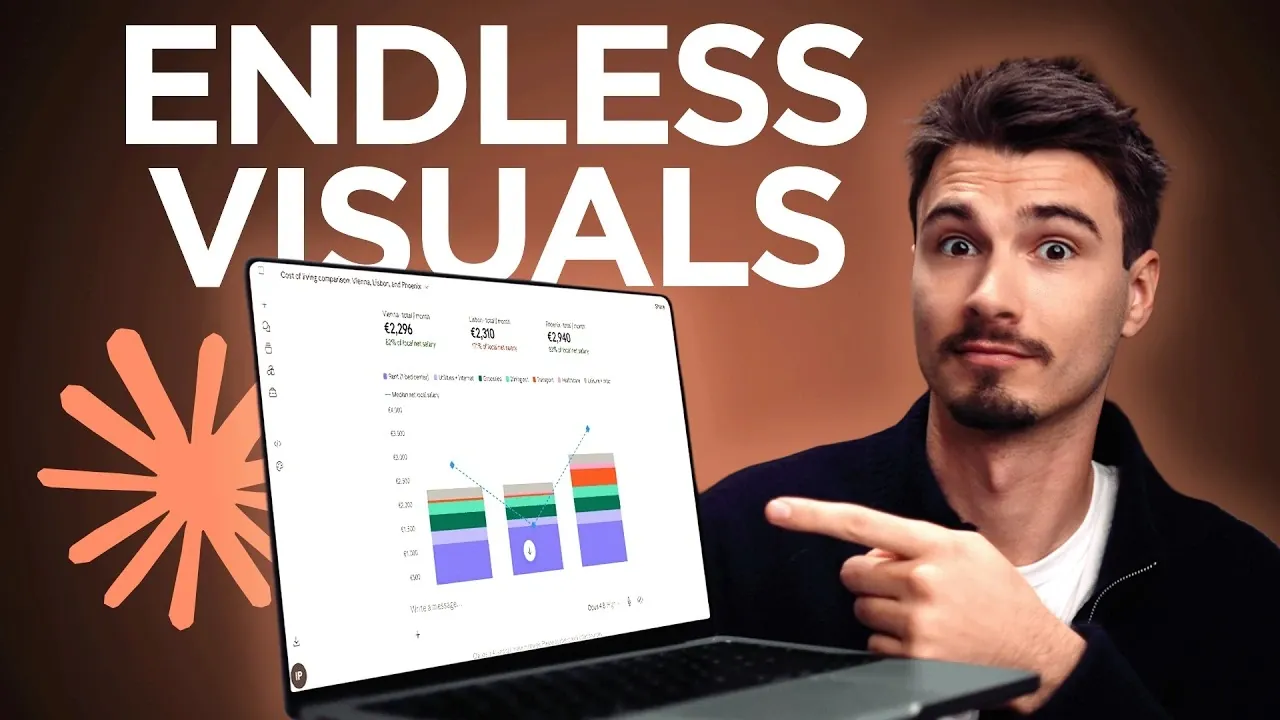
Creating visuals with Claude can be a straightforward process, even for those new to the platform. According to The AI Advantage, a clear and focused prompt is essential for generating relevant outputs. For example, when analyzing the cost of living between two cities, Claude can suggest visual formats like bar charts or pie charts, each designed to emphasize specific aspects of the data. This method ensures that the visuals are both purposeful and tailored to your objectives.
Explore how to brainstorm different visual formats, incorporate interactive elements for clarity and turn your results into shareable outputs. Gain insight into practical steps for refining your visuals, whether you’re working on a presentation, organizing educational content, or simplifying complex datasets.
Visual Learning with Claude
TL;DR Key Takeaways :
- Claude can be used as a visual learning assistant to create interactive and shareable visual aids, referred to as artifacts, for effective communication and learning.
- A well-crafted prompt is essential to generate relevant outputs, allowing users to brainstorm and select the most suitable visual formats for their goals, such as bar charts or interactive tables.
- Interactive visuals allow for real-time adjustments and deeper insights, making them ideal for breaking down complex data and exploring scenarios like cost-of-living comparisons.
- Artifacts elevate visuals into standalone web applications with unique URLs, making them customizable, shareable and accessible across devices for professional or educational use.
- The method is highly adaptable, supporting diverse applications like data visualization, educational tools and decision-making aids, with options for iterative refinement and customization.
1: Crafting a Clear and Focused Prompt
The cornerstone of this process is a well-crafted prompt. A strong prompt ensures that Claude generates relevant and actionable outputs. Begin by asking Claude to brainstorm five visual options for your chosen topic. This initial step allows you to explore multiple perspectives and select the most suitable format for your goals, whether for learning, presenting, or problem-solving.
For example, if you’re analyzing the cost of living between two cities, Claude might propose visuals such as bar charts, pie charts, or interactive tables. Each format offers distinct advantages, allowing you to choose the one that best conveys your data. A bar chart might highlight differences in housing costs, while an interactive table could allow for detailed comparisons across multiple categories.
2: Using Interactive Visuals for Enhanced Clarity
Interactive visuals are a powerful tool for breaking down complex data into digestible formats. These visuals, generated directly in-chat, provide immediate insights and allow for real-time adjustments. This feature is particularly useful for exploring intricate topics or testing various scenarios.
For instance, a cost-of-living comparison could include detailed breakdowns of expenses like housing, transportation and food, presented in an easy-to-read format. By adjusting variables such as income levels or expense categories, you can gain a deeper understanding of the data. This capability is ideal for brainstorming sessions or when you need a quick yet comprehensive overview of a topic.

Deep dive into the latest in Claude AI by exploring our other resources and articles.
- Claude AI Cheat Sheet : The Shortcuts Everyone Should Know
- How Claude is Quietly Automating Complex Video Editing Workflows
- Claude’s Most Powerful Features : Beginners Guide 2026
- How Paperclip Turns Claude Code Into an Entire Automated AI Company
- New Claude Feature Automates Your Tasks While You Sleep
- Meet AutoDream : Claude Code’s Clever New Trick for Memory Management
- Claude Opus 4.7 Leaks & Anthropic’s Full-Stack AI Studio
- Get Certified in AI for Free: Anthropic Launches Massive New Academy
- Skip the Learning Curve : Master Building with Claude Code Quickly
- Stop Using Claude Like a Beginner: Every Skill Level Explained
3: Elevating Visuals with Artifacts
Artifacts take your visuals to the next level by transforming them into standalone web applications. These polished outputs are hosted on unique URLs, making them easy to share and customize. Artifacts are particularly valuable for professional presentations, educational tools, or reusable resources.
Imagine creating a cost-of-living comparison artifact with interactive sliders to adjust income levels or expenses. This dynamic tool not only engages your audience but also provides a more nuanced understanding of the data. The standalone nature of artifacts ensures they are accessible across devices and platforms, enhancing their usability and reach.
4: Adapting the Method for Versatile Applications
The flexibility of this method makes it suitable for a wide range of topics and use cases. Whether you’re visualizing data trends, developing educational aids, or creating decision-making tools, the process can be tailored to your specific needs.
Enhance your outputs with interactive features such as buttons, sliders, or dropdown menus to make them more user-friendly. For example, a tool designed to compare energy consumption across appliances could include sliders to adjust usage hours or dropdown menus to select appliance types. This adaptability allows you to address diverse challenges, from simplifying technical data to creating engaging learning materials.
5: Refining and Customizing Your Outputs
One of the most significant advantages of this method is its ability to streamline the process of understanding and presenting complex topics. By iteratively refining your visuals, you can achieve the desired level of clarity and impact.
Customization further enhances the utility of your outputs. Tailor your visuals and artifacts to meet specific requirements, whether for personal learning or professional use. For instance, an artifact designed for a classroom setting might include interactive quizzes, while one for a business presentation could focus on financial projections. This adaptability ensures the method is accessible to a wide range of users, from beginners to experienced professionals.
How to Create and Share Artifacts
Creating artifacts is a straightforward process. Simply include the keyword “artifact” in your prompt to instruct Claude to convert your visual into a standalone application. Once generated, publish the artifact to obtain a unique web link. This link can then be shared with others, allowing broader accessibility and collaboration.
For example, if you’ve designed an interactive tool to compare energy consumption across appliances, you can share the artifact with colleagues or clients for collaborative analysis. The ability to refine and update the artifact ensures it remains relevant and useful over time, making it a dynamic resource for ongoing projects or discussions.
Unlocking the Potential of Visual Learning with Claude
By transforming Claude into a visual learning assistant, you gain access to a powerful toolkit for exploring and communicating complex ideas. The combination of brainstorming, interactive visuals and artifact creation allows you to generate impactful outputs tailored to your specific needs. Whether you’re a beginner looking to simplify a challenging topic or an experienced professional seeking to enhance your presentations, this structured yet flexible approach ensures quick and efficient results.
Media Credit: The AI Advantage
Disclosure: Some of our articles include affiliate links. If you buy something through one of these links, Geeky Gadgets may earn an affiliate commission. Learn about our Disclosure Policy.