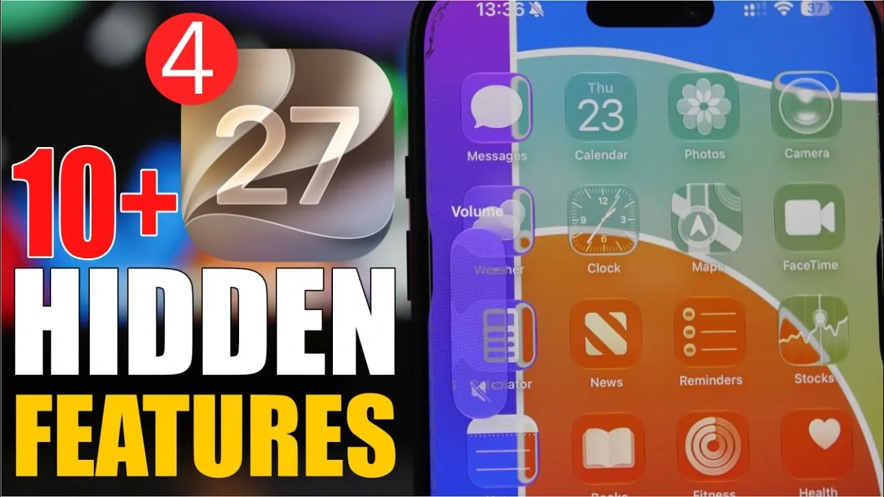
Apple’s iOS 27 Beta 4 introduces a range of hidden features and subtle refinements designed to enhance usability, customization, and aesthetics. These updates demonstrate Apple’s ongoing commitment to improving functionality while maintaining its signature sleek design. From photo adjustments to a redesigned Control Center, this beta offers a glimpse into the future of iOS. Here’s an in-depth look at the key features you should explore. The video below from iReviews gives us more information on the latest beta.

Photo Display Adjustment
One of the standout additions in iOS 27 Beta 4 is the “Zoom Photos to Fill” feature. This new option allows you to adjust the aspect ratio of photos to better fit your screen. Whether you’re browsing your photo gallery or setting a wallpaper, this feature eliminates awkward cropping and empty spaces, making sure your images are displayed optimally. It’s a small but practical improvement that enhances the way you interact with your photos.
Siri Customization
Siri becomes more versatile with the introduction of customizable response previews. You can now choose how many lines of text Siri displays, ranging from none to five. This feature gives you greater control over how much information Siri provides at a glance, making interactions more efficient and tailored to your preferences. Whether you prefer concise responses or detailed previews, this update ensures Siri adapts to your needs.
Enhanced Screen Sharing in iMessage
Screen-sharing in iMessage receives a visual and functional upgrade with the addition of new icons for “Share My Screen” and “Ask to Share Screen.” These distinct icons make it easier to initiate or request screen-sharing sessions during conversations. This improvement streamlines collaboration, making it more intuitive to share content or assist others directly within the Messages app.
Redesigned Control Center
The Control Center gets a fresh look with a “liquid glass” design for AirPods listening modes. This modern aesthetic aligns with the overall design language of iOS 27, enhancing both usability and visual appeal. The redesign not only improves the interface’s appearance but also ensures a seamless and intuitive experience when managing settings. This cohesive design approach reinforces Apple’s focus on blending functionality with style.
Clipboard Previews
Clipboard management sees a significant improvement with the introduction of content previews. When you copy text, images, or other items, a small preview now appears, allowing you to confirm the content before pasting it. This feature is particularly useful for multitasking, making sure greater accuracy and efficiency in your workflow. It’s a simple yet effective addition that enhances productivity.
Dark Mode Enhancements for Widgets
Widgets in dark mode now appear fully black instead of gray, offering improved readability and a more cohesive look. This subtle change enhances the visual consistency of your home screen, especially when dark mode is enabled across the system. The update ensures that widgets blend seamlessly with the overall aesthetic, providing a polished and unified appearance.
Updated Volume Indicator
The volume HUD now adopts the “liquid glass” design introduced in the Control Center. This adaptive update ensures a consistent visual experience across the interface, blending functionality with aesthetics for a more polished look. The new design not only improves the appearance of the volume indicator but also aligns it with the broader design updates in iOS 27.
Background Blur in App Library and Today View
Apple has added a background blur effect to the App Library and Today View, creating a cleaner and more focused appearance. This change improves app visibility and makes navigation more intuitive and visually appealing. The blurred background subtly directs attention to the content, enhancing the overall user experience.
Lock Screen Button Consistency
Lock screen buttons now display consistently in light mode, regardless of whether your device is set to dark mode. This update resolves previous inconsistencies, making sure a uniform and polished appearance for the lock screen interface. The improved consistency contributes to a more cohesive and visually pleasing experience.
Subtle Design Tweaks for a Cohesive Experience
Throughout the system, iOS 27 Beta 4 introduces a variety of subtle design refinements that contribute to a more cohesive user experience. From smoother animations to minor adjustments in layout, these changes enhance the overall fluidity and responsiveness of the interface. These tweaks may not be immediately noticeable, but they collectively improve the way you interact with your device.
What This Means for iOS Users
iOS 27 Beta 4 brings a host of hidden features that enhance both functionality and aesthetics. With updates like photo display adjustments, Siri customization and a redesigned Control Center, Apple continues to refine the iOS experience. These changes focus on usability, personalization and visual appeal, making everyday interactions smoother and more engaging. Whether you’re exploring clipboard previews, enjoying the polished design tweaks, or taking advantage of enhanced screen-sharing in iMessage, this beta version sets the stage for a more intuitive and enjoyable iOS.
Advance your skills in iOS 27 by reading more of our detailed content.
- Apple’s iOS 27 Beta 3 Is Just Days Away: Here’s When It Drops
- iOS 27 Leaks Reveal the End of an Era: Apple’s New Priorities Confirmed
- iOS 27 Beta 2 Changes: What Apple Is Modifying to Improve Performance
- First Look at the Upcoming iOS 27 Beta 4 Update Preview
- Should You Install iOS 27 Beta 3 or Wait for the Public Beta?
- The Difference Between the iOS 27 Public and Developer Betas
Source & Image Credit: iReviews
Disclosure: Some of our articles include affiliate links. If you buy something through one of these links, Geeky Gadgets may earn an affiliate commission. Learn about our Disclosure Policy.
