Excel’s versatility makes it a compelling choice for creating Gantt charts tailored to project management needs. My Online Training Hub demonstrates how to use Excel’s built-in features, like conditional formatting and WORKDAY.INTL functions—to design a dynamic Gantt chart that updates automatically as project details evolve. By starting with a structured task list that includes fields such as task owner, start date and duration, you can build a chart that adapts seamlessly to changes while maintaining clarity and accuracy.
In this breakdown, you’ll learn how to apply color-coded conditional formatting to visually track task progress and highlight key dates, such as deadlines or weekends. Discover how to automate calculations for task timelines and integrate summary metrics to provide a high-level view of your project’s status. With these techniques, you’ll be equipped to create a practical and visually engaging Gantt chart that supports effective project tracking from start to finish.
Excel Gantt Chart Guide
TL;DR Key Takeaways :
- Creating an Excel-based Gantt chart is a cost-effective and customizable solution for project management, using Excel’s built-in tools like tables, formulas and conditional formatting.
- A well-structured task list with fields such as Task Name, Phase, Owner, Start Date and Duration is essential for building an accurate and actionable Gantt chart.
- Automating date calculations using Excel functions like WORKDAY.INTL and SEQUENCE ensures dynamic updates to the project timeline, reducing manual errors.
- Conditional formatting enhances the chart’s visual appeal by dynamically representing task durations, progress and key dates like weekends and the current date.
- Including progress tracking, summary metrics and a clear legend ensures the Gantt chart remains an effective and adaptable tool for monitoring project status and team alignment.
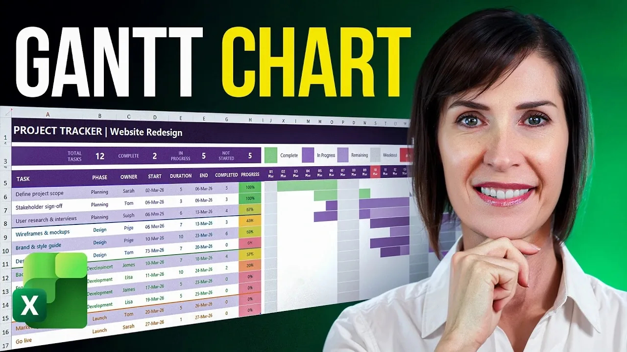
1: Setting Up Your Task List
The foundation of a successful Gantt chart lies in a well-structured task list. Begin by creating a table in Excel that includes the following essential details for each task:
- Task Name: A concise description of the task.
- Phase: The project phase or category the task belongs to.
- Owner: The individual responsible for completing the task.
- Start Date: The scheduled start date of the task.
- Duration: The estimated time required to complete the task (in days).
To streamline data entry and minimize errors, use Excel’s data validation feature to create dropdown menus for fields like “Phase” and “Owner.” This ensures consistency and makes it easier to update task details as your project evolves. A well-organized task list not only simplifies the chart creation process but also ensures your project data remains accurate and actionable.
2: Designing a Clear and Professional Layout
A Gantt chart’s usability depends heavily on its layout. A clear and professional design ensures that your chart is easy to read and interpret, even for complex projects. Consider these design tips:
- Apply custom color themes to differentiate sections or phases of your chart.
- Adjust column widths, row heights and text alignment to enhance readability.
- Use Excel’s table styles to create a polished and professional appearance.
These adjustments not only improve the chart’s visual appeal but also make it more accessible for team members and stakeholders. A well-designed layout ensures that your Gantt chart remains a practical tool throughout the project lifecycle.

Unlock more potential in Excel functions by reading previous articles we have written.
- New Excel Features 2026 : 17 Tools to Speed up Work
- Modern Excel Functions to Know in 2026 for Faster Analysis
- Best Excel Functions for Data Analysis in 2026 : FILTER, XLOOKUP, LET
- 8 New 2026 Excel Features to Build Dashboards & Clean Messy Data Faster
- 10 New Excel Functions to improve your formulas
- Master Excel 2025 : New Features for Desktop, Web, Mac & iPad
- Best Excel formulas and functions
- How to Use Excel’s Copilot() for Smarter Data Analysis
- Excel Functions Guide 2026 : SUM to XLOOKUP with Clear Examples
3: Automating Date Calculations
Automating date calculations is essential for maintaining an accurate and up-to-date project timeline. Excel provides powerful functions to simplify this process:
- WORKDAY.INTL: Calculate task end dates while excluding weekends or custom non-working days.
- SEQUENCE: Generate a dynamic series of dates to represent your project timeline, making sure it spans the entire project duration.
By incorporating these functions, your Gantt chart will automatically adjust to changes in task schedules, saving time and reducing the risk of manual errors. This automation ensures that your project timeline remains reliable and responsive to updates.
4: Adding Conditional Formatting
Conditional formatting is the key to transforming your Gantt chart into a visually engaging and intuitive tool. It allows you to represent task durations and progress dynamically. Here’s how to implement it:
- Use formulas to create task bars that highlight the duration of each task based on start and end dates.
- Apply color-coding to differentiate between completed, in-progress and pending tasks.
- Shade weekends and highlight the current date to provide better context for your timeline.
These visual elements make it easier to track your project’s progress at a glance, making sure that your team stays aligned and informed.
5: Tracking Task Progress
Monitoring task progress is crucial for effective project management. Enhance your Gantt chart by adding columns to calculate:
- Completed Days: The number of days a task has been worked on so far.
- Progress Percentage: The percentage of the task that has been completed.
Use conditional formatting to create visual progress indicators, such as gradient-filled bars, that show how much of each task is complete. These indicators provide an at-a-glance view of your project’s status, helping you identify areas that may require additional attention or resources.
6: Including Summary Metrics
For a high-level overview of your project’s progress, include summary metrics at the top or bottom of your Gantt chart. Key metrics to track include:
- Total number of tasks.
- Number of completed tasks.
- Tasks currently in progress.
- Tasks not yet started.
These metrics provide valuable insights into your project’s overall status, helping you identify potential bottlenecks and ensure that your team stays on track to meet deadlines.
7: Adding a Legend and Finalizing the Chart
A clear legend is essential for explaining the formatting and color-coding used in your Gantt chart. Include a legend that defines the meaning of each color or pattern, making sure that all users can interpret the chart accurately. Before finalizing, test your chart by updating task details to confirm that it responds dynamically. This step ensures that your Gantt chart remains a reliable and adaptable tool throughout the project lifecycle.
Maximizing the Benefits of an Excel Gantt Chart
By using Excel’s powerful features, you can create a dynamic and visually engaging Gantt chart that serves as a practical alternative to traditional project management tools. This approach eliminates the need for additional software, offering a cost-effective and customizable way to track tasks, timelines and progress. Whether you’re managing a small team or a complex project, an Excel-based Gantt chart provides the flexibility and functionality needed to stay organized and achieve your goals.
Media Credit: MyOnlineTrainingHub
Disclosure: Some of our articles include affiliate links. If you buy something through one of these links, Geeky Gadgets may earn an affiliate commission. Learn about our Disclosure Policy.