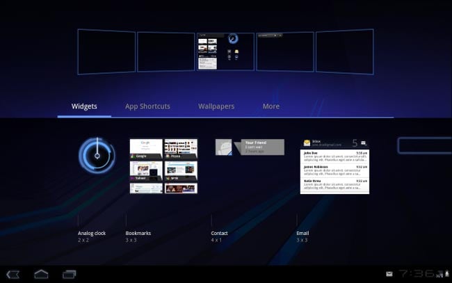
Recently, Google released a preview of the Android 3.0 Honeycomb SDK, and the guys over at Ars Technica have been taking a look at the new user interface in the tablet version of Google’s Android OS.
The Motorola Xoom tablet will be one of the first tablets to use Android 3.0, so this preview gives us a look at what the UI will be like on the Xoom and other tablets.

The picture above is of the Honeycomb home screen, which as you can see features a range of scrolling widgets, and is designed to show off much more content than any of the home screens we have seen in previous versions of Android. This new design is a significant departure from the smartphone-centric interfaces of earlier Android versions, focusing instead on leveraging the larger screen real estate of tablets. The widgets are not only more interactive but also more informative, providing users with real-time updates and quick access to essential functions.
Customizable Home Screens
As you will see in the photo below, you will be able to have up to five different home screens in Android 3.0 Honeycomb, and each one can be customized with a range of widgets and apps. This flexibility allows users to tailor their tablet experience to their specific needs, whether it’s for work, entertainment, or staying connected with friends and family. The ability to add multiple home screens means that users can organize their apps and widgets in a way that makes the most sense to them, reducing clutter and improving efficiency.

The new interface also introduces a revamped notification system that is less intrusive and more informative. Notifications appear in the lower right corner of the screen, allowing users to quickly glance at updates without interrupting their current activity. This is particularly useful for multitasking, as it enables users to manage their notifications more efficiently.
Enhanced Multitasking and Performance
One of the standout features of Android 3.0 Honeycomb is its enhanced multitasking capabilities. The new task manager, accessible from the system bar, allows users to switch between recent apps with ease. This is a significant improvement over previous versions, where multitasking was more cumbersome and less intuitive. The system bar also provides quick access to essential functions such as back, home, and menu, making navigation more straightforward and user-friendly.
In addition to these user interface improvements, Honeycomb also brings performance enhancements that make the overall experience smoother and more responsive. The new graphics engine, known as “RenderScript,” takes full advantage of the hardware capabilities of modern tablets, delivering stunning visuals and fluid animations. This makes activities such as gaming, video playback, and web browsing more enjoyable and immersive.
Another notable feature is the improved web browser, which now includes tabbed browsing, form auto-fill, and a new “incognito” mode for private browsing. These enhancements make the browsing experience on tablets more akin to that on desktop computers, providing users with a more versatile and powerful tool for accessing the internet.
Head on over to Ars Technica for lots more photos and details of what the Android 3.0 Honeycomb UI will look like.
Latest Geeky Gadgets Deals
Disclosure: Some of our articles include affiliate links. If you buy something through one of these links, Geeky Gadgets may earn an affiliate commission. Learn about our Disclosure Policy.