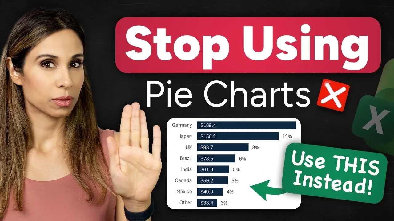
Pie charts are a common choice for visualizing data, but their limitations often make them less effective in professional or technical contexts. As explained by Leila Gharani, pie charts struggle to handle datasets with more than a few categories, leading to cluttered visuals and imprecise comparisons. For example, when attempting to display ten categories in a single chart, the result can be a confusing array of slices that fail to communicate key insights clearly. To address these challenges, clustered bar charts offer a more structured and versatile alternative, particularly for datasets requiring detailed analysis or frequent updates.
In this overview, you’ll learn why clustered bar charts are a superior option for presenting complex data. Key benefits include their improved readability, which allows for easy comparisons between categories, and their ability to handle dynamic updates when linked to live datasets. You’ll also explore practical steps for creating and customizing clustered bar charts in Excel, such as formatting data labels, sorting for impact, and incorporating calculated metrics like percentages or totals. These techniques will help you create clear, professional visuals that effectively convey your data’s story.
Pie Charts vs Bar Charts
TL;DR Key Takeaways :
- Pie charts are limited in effectiveness for complex datasets due to cluttered visuals, lack of precision, and inability to incorporate additional metrics.
- Clustered bar charts offer improved readability, dynamic updates, and the ability to include additional context like totals and percentages.
- Bar charts allow for sorting and better highlight trends, making them more suitable for professional and technical presentations.
- Creating clustered bar charts in Excel involves organizing data, inserting the chart, formatting for clarity, and allowing dynamic updates for real-time accuracy.
- Clustered bar charts are versatile and widely applicable in business presentations, financial overviews, and performance reviews, offering clear and actionable insights.
The Problem with Pie Charts
Pie charts are most effective when dealing with datasets containing only a few categories. However, as the number of categories increases, their utility declines significantly. This is due to several inherent limitations:
- Cluttered Visuals: With more than three or four categories, pie charts become visually overwhelming, making it difficult to distinguish between slices.
- Lack of Precision: Small differences between data points are hard to interpret, leading to potential miscommunication or misunderstanding.
- Limited Metrics: Pie charts struggle to incorporate additional information, such as totals or percentages, without overcomplicating the design.
For example, imagine attempting to compare ten categories in a single pie chart. The result is a chaotic array of small, uneven slices that fail to effectively communicate the data. This lack of precision and clarity can lead to confusion, especially when presenting to audiences that require detailed insights.
Why Clustered Bar Charts Are Better
Clustered bar charts address many of the shortcomings associated with pie charts. They offer a structured and visually clear way to present data, particularly when dealing with multiple categories or metrics. Here’s why they are a better alternative:
- Improved Readability: Bar charts display data in a linear format, making it easier to compare values and identify trends at a glance.
- Dynamic Updates: They can be linked to live datasets, making sure that any changes are automatically reflected in the chart.
- Additional Context: Bar charts allow for the inclusion of totals, percentages, and other calculated metrics without cluttering the visualization.
- Sorting Options: Data can be arranged in ascending or descending order, helping to highlight key patterns and trends more effectively.
For instance, in a business presentation, a clustered bar chart can clearly illustrate sales performance across regions. Each bar represents a region, with its corresponding sales figures displayed in a way that is both intuitive and precise.
Stop Using Pie Charts in Excel

Browse through more resources below from our in-depth content covering more areas on Excel functions.
- New Excel Features 2026 : 17 Tools to Speed up Work
- 8 New 2026 Excel Features to Build Dashboards & Clean Messy Data Faster
- 10 New Excel Functions to improve your formulas
- Master Excel 2025 : New Features for Desktop, Web, Mac & iPad
- Pick the Best Excel Wildcard Filter Method for Your Needs
- Best Excel formulas and functions
- How to Use Excel’s Copilot() for Smarter Data Analysis
- How to Use Excel Database Functions for Advanced Data Management
- Copilot in Excel, Beginner Guide to Charts, Formulas, AI
- Excel Functions Guide 2026 : SUM to XLOOKUP with Clear Examples
How to Create a Clustered Bar Chart in Excel
Creating a clustered bar chart in Excel is a straightforward process that can significantly enhance your data visualization. Follow these steps to create a professional chart:
- Prepare Your Data: Organize your dataset in a table format, making sure that each category and its values are clearly labeled. Use formulas to calculate percentages or totals if necessary.
- Insert the Chart: Highlight your data and select the clustered bar chart option from Excel’s chart menu. This will generate the basic structure of your chart.
- Format for Clarity: Adjust the spacing between bars, apply consistent colors, and add data labels to display values directly on the chart.
- Enable Dynamic Updates: Use cell references in your dataset so that any changes are automatically reflected in the chart.
- Enhance with Calculations: Include calculated metrics, such as percentages or totals, to provide additional context. For example, show each category’s contribution to overall revenue.
- Sort for Impact: Use Excel’s sort function to arrange data in a logical order, such as highest to lowest value, to emphasize key trends.
By following these steps, you can create a clustered bar chart that is both visually appealing and highly informative.
Customization Tips for Better Visuals
To maximize the impact of your clustered bar chart, consider applying the following customization techniques:
- Data Labels: Format labels to include relevant units, such as percentages or currency symbols, to enhance clarity and context.
- Chart Title: Use a descriptive title that highlights key metrics, such as “Revenue by Product Category: $1.2M.”
- Consistent Formatting: Apply uniform decimal places, highlight specific data points, or use conditional formatting to draw attention to outliers or trends.
These adjustments can significantly improve the professionalism and readability of your chart, making sure that your audience can easily interpret the data.
Pie Charts vs. Bar Charts: A Direct Comparison
While pie charts and bar charts can both be used to display similar datasets, bar charts offer distinct advantages in several critical areas:
- Clarity: Bar charts present data in a linear, easy-to-read format, while pie charts rely on interpreting slice sizes, which can be imprecise.
- Flexibility: Bar charts support sorting, dynamic updates, and the inclusion of additional metrics, features that pie charts lack.
- Professionalism: Bar charts are better suited for business and technical presentations, where precision and clarity are essential.
For example, a pie chart attempting to display survey results across ten response categories may struggle to convey differences effectively. In contrast, a bar chart can rank these categories in order of popularity, providing a clear and actionable visualization.
Real-World Applications
Clustered bar charts are highly versatile and can be applied across various professional contexts. Here are some common use cases:
- Business Presentations: Compare sales performance, market share, or customer demographics across multiple categories.
- Financial Overviews: Highlight expense breakdowns, revenue streams, or budget allocations with precision and clarity.
- Performance Reviews: Showcase team achievements, productivity metrics, or project milestones in a structured and organized format.
For example, a financial analyst can use a clustered bar chart to identify which expense categories are driving budget overruns. This insight enables more informed decision-making and strategic planning.
Media Credit: Leila Gharani
Disclosure: Some of our articles include affiliate links. If you buy something through one of these links, Geeky Gadgets may earn an affiliate commission. Learn about our Disclosure Policy.