Creating an Excel dashboard no longer requires hours of manual effort or advanced technical skills. With the help of AI platforms like ChatGPT, Claude and Gemini, you can now generate dashboards in a matter of seconds. Excel Campus – Jon demonstrates how these AI systems can assist in tasks such as generating realistic datasets, designing layouts and even building interactive features directly in Excel. For example, you can use AI to create fake sales data that includes seasonal trends or anomalies, making sure your dashboard is both functional and reflective of real-world scenarios.
In this hands-on walkthrough, you’ll explore how to generate tailored datasets that align with your project’s goals, design effective visualizations using AI-generated layouts and incorporate interactive elements like slicers and pivot tables into your Excel dashboards. You’ll also learn how to refine AI-generated outputs to ensure they meet professional standards and communicate insights clearly. By the end, you’ll have actionable strategies for using AI to simplify and enhance your dashboard creation process.
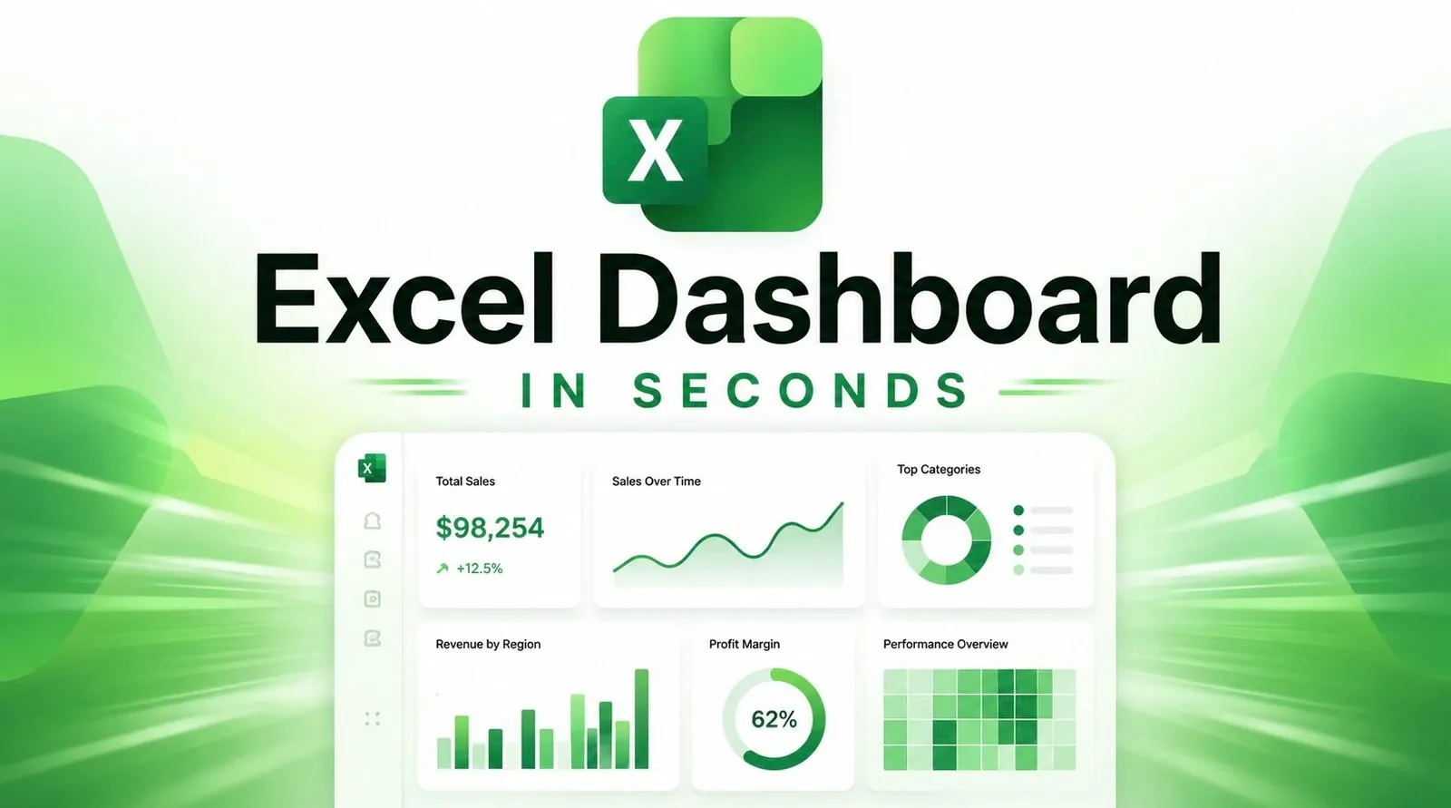
Excel Dashboard Creation
TL;DR Key Takeaways :
- AI tools like ChatGPT, Claude and Gemini simplify and accelerate the process of creating Excel dashboards, from generating datasets to designing layouts and visualizations.
- AI can generate realistic fake datasets to maintain data privacy while mimicking real-world trends, making sure functional and reliable data for dashboards.
- AI assists in designing visually appealing dashboards by allowing users to specify visualization types, tailor designs to audiences and iterate for clarity and focus.
- AI-powered tools like Copilot help build dynamic Excel dashboards with features such as pivot tables, slicers and interactive charts for enhanced data exploration.
- Using AI for dashboard creation offers advantages like time efficiency, accessibility for non-experts, rapid experimentation and safeguarding sensitive information.
Data is the foundation of any dashboard. When real-world data is unavailable, incomplete, or sensitive, AI tools like ChatGPT can generate realistic fake datasets that mimic actual trends and patterns. This ensures privacy while providing a reliable and functional dataset for your dashboard.
- Define the data type: Use specific prompts to request data tailored to your needs, such as sales figures, customer demographics, or seasonal trends.
- Validate the output: Review the generated data for accuracy, consistency and alignment with your project’s objectives.
- Incorporate realism: Refine the dataset to include realistic elements like anomalies, seasonal spikes, or gradual growth patterns.
For example, if you are building a retail sales dashboard, you can prompt the AI to include holiday season spikes and year-over-year growth trends. This approach ensures the data feels authentic and supports meaningful analysis, even when working with hypothetical scenarios.
Designing Dashboards with AI
AI tools like Claude, Gemini and ChatGPT can assist in designing dashboards that are visually appealing and aligned with best practices in data visualization. By providing clear and detailed instructions, you can guide these tools to create layouts that effectively communicate your insights.
- Specify visualization types: Clearly outline the charts or graphs you need, such as bar charts, line graphs, or pie charts.
- Tailor to your audience: Share details about your target audience and the key insights you want to emphasize.
- Iterate and refine: Use natural language feedback to adjust the design, improving clarity and focus.
For instance, if the initial design lacks emphasis on key metrics, you can request changes like “Add a summary table for key performance indicators” or “Highlight revenue trends with a line graph.” This iterative process allows you to experiment with different layouts and find the most effective way to present your data.

Enhance your knowledge on Excel dashboards by exploring a selection of articles and guides on the subject.
- How to create Excel dashboards with Claude 3 AI in minutes
- Master Excel Dashboards : Easily Transform Data Into Stunning Visuals
- How to Build Interactive Excel PivotTable Dashboards in 2026 with Copilot Shortcuts
- The benefits of Excel interactive dashboards and how to make them
- How to Build a Professional Excel Dashboard with Stunning Visuals
- How to build Microsoft Excel interactive dashboards
- How to Build Interactive Dashboards in Excel 2024
- Using Excel Power BI Desktop to build spreadsheet Interactive Dashboards
- Create Stunning Excel Dashboards in Seconds with AI : You Won’t Believe How Easy It Is
- Convert an Excel Spreadsheet Into an App Without Coding
Building Dashboards in Excel
Once your dashboard design is finalized, the next step is to bring it to life in Excel. AI tools like Copilot can assist in creating dynamic dashboards with features such as pivot tables, slicers and interactive charts, allowing users to explore data more effectively.
- Use AI-generated designs: Use the designs created by AI as a blueprint for structuring your Excel dashboard.
- Incorporate dynamic elements: Add pivot tables, slicers and charts to enable interactive filtering and deeper analysis.
- Customize for usability: Make manual adjustments to enhance the dashboard’s visual appeal and functionality.
For example, Copilot can automate the creation of a sales dashboard by generating pivot tables that summarize revenue by region, product category, or time period. You can then customize the layout to align with your design preferences and ensure it meets the needs of your audience.
Best Practices for AI-Driven Dashboard Creation
To maximize the benefits of AI tools in dashboard creation, it is essential to follow a set of best practices. These guidelines will help you achieve professional results while making sure the dashboard meets your objectives.
- Engage stakeholders: Gather feedback from colleagues or stakeholders on AI-generated designs before finalizing them.
- Provide clear prompts: Use detailed and specific instructions to guide AI tools, making sure the output aligns with your goals.
- Focus on interactivity: Incorporate features like slicers and pivot tables to enhance data exploration and usability.
- Iterate quickly: Use natural language feedback to refine designs and improve clarity and effectiveness.
By involving stakeholders early in the process and iterating on designs, you can create dashboards that deliver actionable insights and meet user expectations.
Advantages of Using AI for Dashboard Creation
AI offers numerous advantages for creating Excel dashboards, making it a valuable tool for both beginners and experienced professionals. By automating repetitive tasks and simplifying complex processes, AI enables you to focus on analyzing data and delivering insights.
- Time efficiency: Significantly reduces the time required to design and build dashboards.
- Rapid experimentation: Allows for quick testing of different layouts and visualization styles.
- Accessibility: Minimizes the need for advanced coding or design skills, making dashboard creation more accessible.
- Data privacy: Protects sensitive information by generating realistic fake datasets.
By using AI tools like ChatGPT, Claude and Gemini, you can streamline the dashboard creation process, allowing you to deliver impactful visualizations that drive decision-making and provide valuable insights.
Media Credit: Excel Campus – Jon
Disclosure: Some of our articles include affiliate links. If you buy something through one of these links, Geeky Gadgets may earn an affiliate commission. Learn about our Disclosure Policy.