Android 16, with its Material 3 redesign, set out to redefine the user experience with a modern and expressive interface. However, as you explore its features, several shortcomings become apparent. These range from limited customization options to inconsistent design elements, raising questions about its readiness for a polished, stable release. In the video below from Sam Beckman delves into the key areas where Android 16 struggles and why addressing these issues is critical for its success.=

Lock Screen: A Missed Opportunity for Personalization
The lock screen in Android 16 fails to meet the growing demand for personalization. While many users expect a dynamic and customizable lock screen, Android 16 offers only basic options, leaving much to be desired. Key issues include:
- A lack of a robust lock screen editor, preventing users from tailoring layouts to their preferences.
- Limited clock styles with no depth effects or resizing options, resulting in static and outdated designs.
- No support for always-visible widgets or the ability to remove the clock entirely, frustrating users who prefer a minimalist aesthetic.
These limitations make the lock screen feel rigid and uninspired, falling short of the customization standards set by competing platforms.
Fingerprint Unlock Animation: Lacking Visual Appeal
The fingerprint unlock animation in Android 16 is another area where the system feels underwhelming. Competing Android skins provide dynamic and visually engaging animations that enhance the unlocking experience. In contrast, Android 16’s animation feels basic and outdated, failing to contribute to the overall polish and user satisfaction of the operating system.
Navigation Bar: A Visual Inconsistency
The navigation bar design in Android 16 introduces persistent issues that disrupt the interface’s visual harmony. Key problems include:
- An intrusive presence that detracts from the overall flow of the interface.
- Inconsistent background elements across apps, creating a disjointed and unpolished experience.
These inconsistencies undermine the cohesive aesthetic that users expect from a modern operating system, making the navigation bar feel like an afterthought rather than an integral part of the design.
Home Screen Customization: Falling Short of Expectations
Android 16’s home screen customization options are surprisingly restrictive, limiting your ability to create a personalized and engaging experience. Key shortcomings include:
-
- No ability to remove default widgets like “At a Glance” or the search bar, which restricts layout flexibility.
- Lack of support for third-party icon packs and limited grid size options, reducing the scope for visual customization.
- No features like double-tap to lock or the ability to disable app labels, which are common in other Android skins.
<liFlat and uninspired animations that lack the fluidity and responsiveness seen in competing systems.
These limitations hinder the ability to craft a home screen that reflects individual preferences, leaving users with a less engaging experience.
Third-Party Launcher Compatibility: A Step Backward
For users who prefer third-party launchers, Android 16 presents significant challenges. Gestural navigation animations are tied exclusively to the stock launcher, leading to janky transitions and a less seamless experience when using alternatives. This restriction undermines Android’s reputation for flexibility and customization, alienating a segment of users who rely on third-party launchers for their preferred interface.
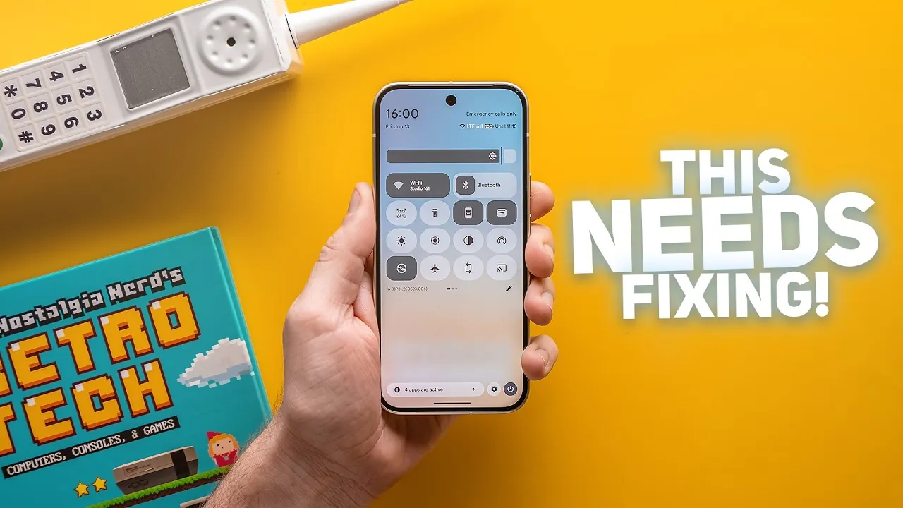
Quick Settings Panel: Design and Functionality Issues
The Quick Settings panel in Android 16 struggles with both design and usability, making it feel clunky and outdated. Key concerns include:
- A poorly designed brightness slider and an unintuitive toggle editing interface that complicate basic adjustments.
- Inconsistent toggle shapes and limited functionality, such as the absence of flashlight intensity adjustment.
- Cartoonish font styles and outdated Wi-Fi and data icons that detract from the panel’s aesthetic appeal.
These issues make the Quick Settings panel less intuitive and less visually appealing than those found in competing systems.
Volume Panel: Overdesigned and Inefficient
The volume panel in Android 16 is overly large and cluttered with unnecessary design elements. This overdesign makes volume adjustments less efficient, particularly for users who value simplicity and ease of use. A more compact and intuitive design would greatly improve the usability of this feature.
Haptics and Refresh Rate: Missing Fine-Tuning
Android 16 falls short in providing granular control over haptics and refresh rate settings, which are essential for a refined user experience. Notable issues include:
- No options to adjust keyboard vibration intensity or fine-tune haptic feedback settings, limiting user control.
- Some devices default to a 60 Hz refresh rate without offering the option to choose during setup, reducing the smoothness and responsiveness associated with higher refresh rates.
These oversights diminish the tactile and visual experience that users expect from a modern operating system, leaving room for improvement.
Camera App: Performance Problems Persist
The camera app in Android 16 continues to struggle with performance issues that impact photo and video quality. Key problems include:
- Persistent shutter lag and jittery video recording, which undermine the quality of captured moments.
- Clunky lens switching during video capture and subpar portrait mode performance, with harsh cutouts and slow processing.
- An outdated cinematic blur feature that remains limited to 1080p resolution.
- Poor third-party app camera quality, particularly in apps like Instagram and TikTok, where image processing falls short.
These shortcomings make the camera experience feel inconsistent and underwhelming, especially when compared to the competition.
Refining Android 16 for a Better Future
While Android 16’s Material 3 redesign introduces a modern aesthetic, its potential is overshadowed by numerous usability and functionality issues. From limited customization options to inconsistent design elements and underperforming features, these shortcomings highlight the need for significant improvements. Addressing these concerns is essential for Google to deliver a competitive and satisfying user experience with Android 16. By refining these aspects, Android 16 could truly live up to its promise of a fresh and expressive operating system.
Uncover more insights about Android 16 Material 3 Redesign in previous articles we have written.
- Material 3 Expressive in Android 16: Everything You Need to Know
- Android 16 QPR1 Features: Material Design 3 and Key Updates
- The Big Leap: Android 16 Material 3 Expressive vs. Android 15’s
- Android 16 Update: Top Features and Enhancements
- Android 16 vs iOS 18 vs One UI 7: A Comprehensive Comparison
Source & Image Credit: Sam Beckman
Disclosure: Some of our articles include affiliate links. If you buy something through one of these links, Geeky Gadgets may earn an affiliate commission. Learn about our Disclosure Policy.