Building a production-ready design system with AI provides a structured approach to creating scalable and consistent user interfaces while minimizing repetitive tasks. As explained by AI Builder Space, this process often involves platforms like Figma to define design requirements, generate reusable components, and integrate these elements into development workflows. A key feature, such as design tokens for managing properties like colors and typography, ensures uniformity across designs and streamlines collaboration between design and development teams.
This tutorial covers how to establish foundational elements like typography, spacing, and color schemes, as well as how to build reusable components such as buttons and tables. It also examines strategies for integrating the design system into development environments, whether through automated processes or manual adjustments, and discusses the role of Figma boards in organizing and refining design assets. These insights will help you create a system that balances technical precision with adaptability for future projects.
AI-Powered Design Systems
TL;DR Key Takeaways :
- Define clear project requirements and user stories to shape the structure and functionality of your design system, making sure alignment with functional goals and visual identity.
- Gather inspiration using tools like Mobbin.com to create a mood board, establishing a consistent design language and aligning team members on aesthetic and functional goals.
- Use AI-powered tools in Figma to design and customize UI components efficiently, balancing automated generation with tailored customization to reflect brand identity.
- Develop a scalable design system by starting with foundational elements (colors, typography, spacing) and expanding with reusable components and design tokens for consistency and collaboration.
- Integrate the design system into development workflows using tools like Cursor or GitHub, and choose between automated workflows or manual integration based on project needs.
1: Define Your Requirements
The foundation of any design system begins with a clear understanding of your project’s needs. Start by defining product requirements and user stories, as these will shape the structure and functionality of your design system. Identify the key components and pages your UI will require, such as:
- Navigation bars
- Buttons
- Tables
- Dashboards
This step ensures that your design system aligns with both the functional goals and the visual identity of your project. A well-defined set of requirements serves as a roadmap, guiding the design process and reducing the risk of inconsistencies.
2: Gather Inspiration
Before diving into design, gather inspiration to establish a creative direction. Tools like Mobbin.com are invaluable for exploring design patterns and examples for various UI components. Use these references to create a mood board that organizes ideas for each page and component.
A thoughtfully curated mood board helps maintain a consistent design language throughout the project. It also provides a visual reference for your team, making sure that everyone is aligned on the project’s aesthetic and functional goals.
Build a Production-Ready Design System with AI
Explore further guides and articles from our vast library that you may find relevant to your interests in AI Tools.
- Google AI Tools Overview from Gemini to NotebookLM
- 6 Free Google AI Tools That Outperform Paid AI Subscriptions in 2026
- Best Free AI Search Tools for Daily Questions, Shopping & Fixes
- 7 Powerful Free Google AI Tools to Build Apps, Visuals & More
- Best AI Tools to Start 2026: Perplexity, Gemini 3 Pro, DeepSeek 3.2
- Skywork vs Gamma : Which AI Tool Creates The Best Presentations?
- The Ultimate Guide to AI Tools What’s Worth Your Money
- Choose Native AI Tools To Save Time Across Your Workflows in 2026
- JustDone AI Review
- ChatGPT vs Copilot : AI Tools for Business Compared
3: Create and Customize UI Designs
With your inspiration in place, begin designing your UI components in Figma. AI-powered tools within Figma can accelerate this process by generating layouts and elements based on your mood board. For example, you can quickly design navigation bars, buttons, and dashboards using these tools.
After generating the initial designs, customize them to meet your project’s specific requirements. Ensure that the designs reflect your brand identity and address user needs. This step bridges the gap between automated design generation and tailored customization, resulting in a system that is both efficient and unique.
4: Develop the Design System
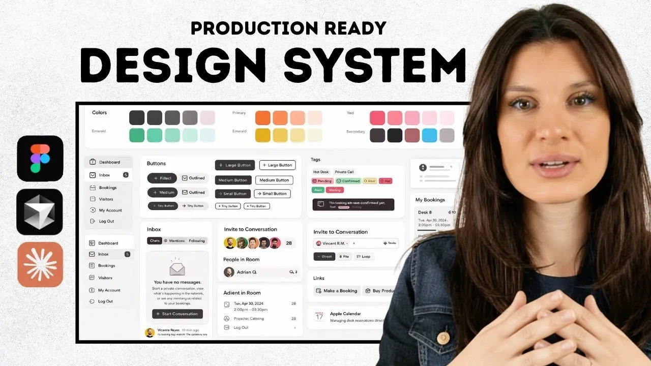
A robust design system is the backbone of scalable UI development. Begin by creating a minimum viable design system that includes the following foundational elements:
- Colors
- Typography
- Spacing
- Radius
Next, expand your system by adding reusable components such as buttons, input fields, cards, badges, and tables. For larger projects, consider breaking the design system into smaller, modular sections. This modular approach simplifies updates and makes it easier to integrate new components as your project evolves.
Incorporate design tokens, which are reusable variables for properties like colors, typography, and spacing. By replacing hardcoded values with tokens, you enhance scalability and ensure consistency across your designs. This practice also simplifies collaboration between designers and developers, as tokens provide a shared language for design specifications.
5: Integrate and Collaborate
Once your design system is complete, the next step is to integrate it into your development workflow. Export your designs to development environments such as Cursor or GitHub, which assist seamless collaboration between designers and developers.
Organize your screens and design systems using Figma boards. This structure improves accessibility and allows teams to refine and implement designs more efficiently. If your development environment supports it, you can directly push generated code from Figma. Alternatively, you can manually integrate the design system into your codebase, making sure that all components and styles are implemented correctly.
6: Choose Your Implementation Method
Decide on the most suitable implementation method for your workflow. The two primary options are:
- Automated workflows: Push code directly to development environments to save time and reduce errors. This method is ideal for projects with tight deadlines or limited resources.
- Manual integration: Offers greater control and customization, allowing you to fine-tune the design system to meet specific project needs. This approach is better suited for complex projects requiring a high degree of precision.
Regardless of the method you choose, maintain open communication between designers and developers. Tools like Figma boards can assist this collaboration, making sure that the design system meets the expectations of all stakeholders and functions as intended.
Best Practices for Long-Term Success
To ensure the long-term success of your design system, consider the following best practices:
- Regular updates: Continuously refine and expand your design system to accommodate new components and evolving project requirements.
- Documentation: Maintain comprehensive documentation for your design system, including guidelines for usage, examples, and design tokens. This ensures consistency and simplifies onboarding for new team members.
- Feedback loops: Encourage feedback from both designers and developers to identify areas for improvement and address potential issues early.
- Scalability: Design your system with scalability in mind, making sure it can adapt to future projects or changes in technology.
By following these practices, you can create a design system that not only meets your current needs but also serves as a foundation for future growth and innovation.
Media Credit: AI Builder Space
Disclosure: Some of our articles include affiliate links. If you buy something through one of these links, Geeky Gadgets may earn an affiliate commission. Learn about our Disclosure Policy.