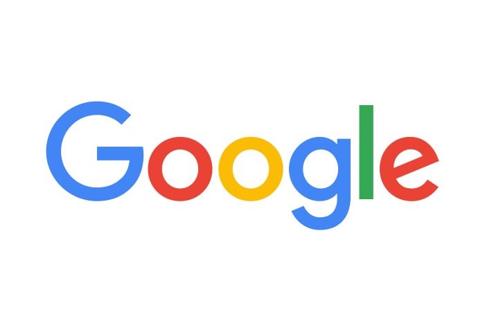
Google has today unveiled a new Google logo for 2015, following on from the announcement last month that Google would be restructured under a new company called Alphabet.
As you can see from the image above the design is hardly revolutionary and only features a change in font, following on from previous designs that also only experienced font changes since its launch in 1998.

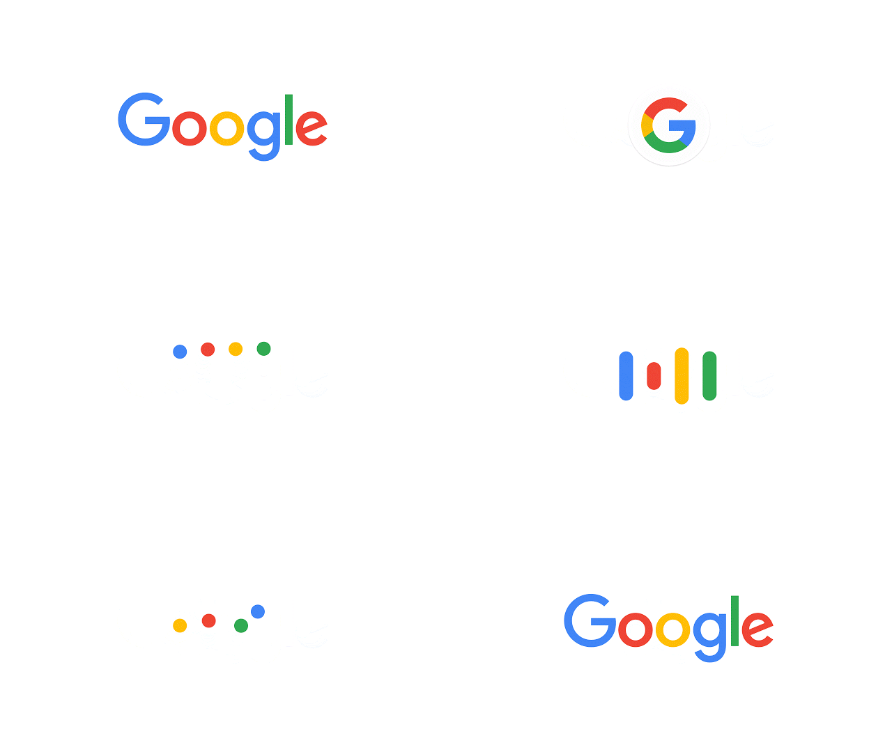
The new Google logo has been created to encompass the ever-growing range of Google products that are available to access from desktop computers to smart TVs and even wrist worn wearables. Google explains a little more :
So why are we doing this now? Once upon a time, Google was one destination that you reached from one device: a desktop PC. These days, people interact with Google products across many different platforms, apps and devices—sometimes all in a single day. You expect Google to help you whenever and wherever you need it, whether it’s on your mobile phone, TV, watch, the dashboard in your car, and yes, even a desktop!
Today we’re introducing a new logo and identity family that reflects this reality and shows you when the Google magic is working for you, even on the tiniest screens. As you’ll see, we’ve taken the Google logo and branding, which were originally built for a single desktop browser page, and updated them for a world of seamless computing across an endless number of devices and different kinds of inputs (such as tap, type and talk).
For more details on the new Google logo design jump over to the official Google blog where more information is provided on why the design has been rolled out.
Source: Google
Latest Geeky Gadgets Deals
Disclosure: Some of our articles include affiliate links. If you buy something through one of these links, Geeky Gadgets may earn an affiliate commission. Learn about our Disclosure Policy.